
Court Baron Scroll
based upon
The Visconti Hours
Marko Evanovich Panfilov
Barony of Dragonsspine,
Kingdom of the Outlands
September 21st, A.S. 38 (2003)

|
Court Baron Scroll
|
|
This scroll is based upon the style of the Visconti Hours, a personal Book of Hours commissioned by Giangaleazzo Visconti in Milan, Italy, late in the 14th century. This extraordinary manuscript was the work of two master illuminators, the first half done by Giovannino dei Grassi, and finished by Belbello da Pavia after Giovannino's death in 1402. The original manuscript belonging to the National Library in Florence, Italy, has been faithfully reproduced in The Visconti Hours, by Millard Meiss and Edith W. Kirsch. While some pages are badly cropped, the details and colors of the original are maintained. This scroll was created in July, A.S. 38 (2003) for Baron's War and awarded to Baron Timothy as he stepped down as Baron of Dragonsspine.
The scroll is mainly based upon LF 80v, the depiction of Moses placed in the Nile and returned by Pharaoh's daughter (see image above). This page is one of the many examples of Giovannino's architectural style of illuminated capitals. The colors were modified to better suit the colors of the arms of the recipient: Per pale azure and argent ermined vert, a chief counterchanged, but are consistent with colors used elsewhere in the manuscript.
 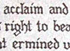 |
The hand used in the Visconti Hours is a modified Gothic, almost an Italian Rotunda, with early Versals used for the initial capitals. A somewhat more generic Gothic hand from Drogin was used for this scroll. In the future, the calligraphy could be improved by paying closer attention to the actual text of the original rather than relying upon a general source such as Drogin. |
| Figure 1. Left: Calligraphy from the Visconti Hours. Right: Calligraphy from the scroll. | |
The original manuscript was likely created using cut quills, usually from a goose, dipped in iron gall ink and written on vellum made from calfskin. Due to the high cost of calfskin vellum, modern Pergamenata paper was used instead. Having worked on actual vellum, I can personally attest to the fact that Pergamenata retains many of the qualities of vellum. In particular, ink and paint stay on the surface of the vellum instead of soaking in as with modern paper. Mistakes can be easily corrected by scraping the ink or paint with a sharp pen knife. A metal nib dip pen was used in place of the quill to avoid the constant sharpening needed by quill pens. Permanent light-fast black ink was used for archival purposes instead of the period ink that is brown and turns black as it oxidizes.
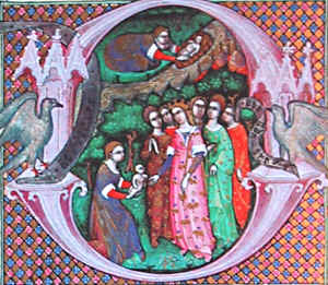  |
The illuminated capital
reflects the architectural style that appears throughout the Visconti
Hours. Show here is initial 'D' from the original, along with the
'U' that was used in the scroll. The capital used in the scroll is a
combination of the lower part of the original 'D', along with towers from
other castles depicted elsewhere in the Visconti Hours. The diaper pattern
background was meticulously reproduced using gold leaf, and alternating
blue and red diamonds, with white work flowers added to the blue and red
areas.
The portrait in the center of the 'U' is an original design depicting the award recipient awaiting battle in his castle. It includes the recipient's arms on the shield and his Baronial coronet. The additional letters in the illumination are versals decorated with white work as in the original manuscript. While I have done several scrolls in the past using the architectural illumination style, this was the first scroll where I combined the illuminated capital along with the full floral border of the original. |

|
|
| Figure 2. Top: Illuminated 'D' from the Visconti Hours. Bottom: Illuminated 'U' from the scroll. Right: Versals from the manuscript. | |
Gold leaf was applied to the leaves on the border, and to the diaper pattern behind the capital. Gold leaf became common in the 10th century Romanesque period and was used extensively in the Visconti Hours, along with gold emulsion. In period, a gesso made of slaked plaster, sugar, hide glue (or fish glue), and white lead would have been used. In the dry climate of Colorado, such a mixture does not work consistently, so a modern substitute of acrylic gloss medium (sometimes called Hyplar) was used instead. Blowing gently on the dried acrylic size makes it tacky, and gold leaf is carefully laid over the surface and burnished until shiny.
  |
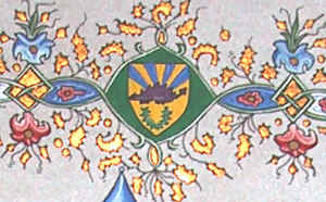
The border of the original page consists of leaves and ivy twisting around to form multiple oval "panels" containing flowers and the Visconti arms. In the scroll, the same style is used and the panels are filled with flowers, "argent ermined vert" from the recipient's arms, and various symbols from the recipients awards and activities. Contained in the border are the Baronial badge of Dragonsspine, the badge of the Outlands, a column representing the Companion of the Stag, a sword representing the Companion of the Stag's Blood, a heart representing the Companion of the Stag's Heart, trumpets representing his service as a Herald, and a fork and spoon representing his interest in cooking. |
| Figure 3. Left: border from the Visconti Hours. Right: border from the scroll. | |
Paints were made in the Middle Ages by dissolving various pigments into
a binder, such as gum arabic or egg yolk. However, many of these pigments were highly toxic.
For example, red paint contained lead or iron. Yellow was made from orpiment, which contained arsenic oxide. Verdigris
green contained copper and strong vinegar, or malachite. Because of the toxic nature of these pigments,
modern gouache was used, and applied with small brushes. Although the actual chemicals are different and safer, gouache
still consists of finely powdered pigments mixed with a binding agent. Many colors in the Visconti Hours are quite unique and unusual
for the period including pinks and violets.
  |
The shading, or "white work"
on the flowers and border was done to match the original manuscript. A diluted
white gouache was applied and blended into the base color using water. Then, a very fine brush was
used with a thicker white gouache for the white lines along the main green
vines.
Very fine white line work can also be seen in the small blue panels around the red flowers in both the original and in the scroll. Many of the green panels in the scroll are also surrounded with fine yellow line work. The fine black lines were done using a "crow quill" pen, which is a sharp metal version of the actual crow's quill used in period. The straight lines in the diaper pattern of the capital were done with a modern engineering pen because it was easier to achieve the uniform lines against a straight-edge with this pen, compared to the free-form action of the crow quill. |
| Figure 4. Top: border from Visconti Hours. Bottom: border from the scroll. | |
 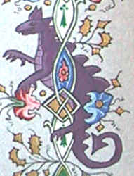 |
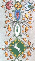
Many pages of the original manuscript also contain a great variety of animals and other illustrations mixed into the border. To reflect this variety and to make the scroll more interesting, a white stag (symbol of the Outlands) and a purple dragon (symbol of Dragonsspine) were added to the scroll border. These particular designs were inspired by sketches done by my teacher, Mistress Tatiana Pavlovna Sokolova. |
| Figure 5. Stag and Dragon hidden in the border of the scroll. | |
This is the most period scroll that I have done to date. It gave me a great sense of accomplishment to finally combine the fantastic architectural illuminated capitals with a full floral Visconti border. It has given me great respect for the skills and artistic talents of the original illuminators. In the future, I will continue to create scroll inspired by period example and will work more on making the calligraphy itself more period.