[Button States tab] [Position/Size tab] [Advanced tab] [Gauge tab]
This Settings Editor dialog page allows you to edit the properties of a Button.
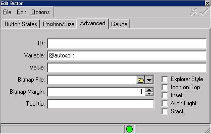
The ID field allows you to assign a short name to this button. This allows you to manipulate the button using the ID instead of the button number.
If a Variable name is assigned to a button, zMUD automatically sets the variable to a value of zero if the button is off, and 1 if it is on. You can also use this field to specify the startup state of a button. Simply assign a variable name and then set the Default value of the variable to one or zero to set the startup state of the button. Note that if you set the startup state to one, the commands assigned to the button's off state will automatically be executed when the MUD character is first loaded. For multi-state buttons, the default state has a value of zero, with the menu states starting at one.
The Value field is used to specify an expression that determines the state of the button. When using the Value expression, you cannot activate the button manually...it is only updated under zMUD control and turned on when the expression is true, and turned off when the expression is false.
The Bitmap file allows you to assign a .BMP file as the icon for the button. You should normally use BMP files with only 16 colors. The Bitmap Margin field specifies the spacing between the bitmap and the caption of the button. The pulldown icon to the right of the Bitmap field allows you to select from one of the builtin images within zMUD. There are over 100 builtin images.
The ToolTip property assigns a help string which is displayed whenever the mouse hovers over the button. This property is expanded whenever you change the value of a scripting variable, so you can use @varname syntax. However, it will not evaluate every time you pass the mouse over it.
 |