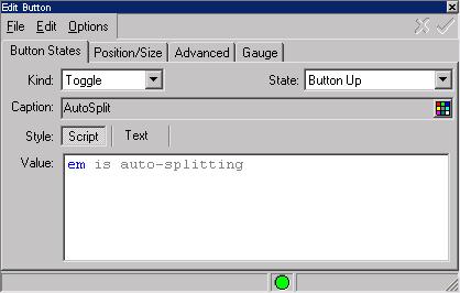
Button States
[Button States tab] [Position/Size tab] [Advanced tab] [Gauge tab]
This Settings Editor dialog page allows you to edit the properties of a Button.

The Kind pulldown sets the type of button. Here are the available button types:
- Push
- Sets the button to be a simple push buttons. A push button has a single state and simply executes the Commands when the button is clicked
- Toggle
- Toggle buttons have two states: On and Off. Select the state you wish to edit from the State field. Each state has a caption displayed on the button, and the Commands to execute when the state changes.
- Separator
- Not really a button, but simply adds a spacer to the button bar to separate other buttons. Control the width of the separator in the Position/Size tab.
- Multistate
- Allows you to assign a menu of multiple states to a button. When this is selected, you will also be able to select the number of states for the button.
- Menu
- Similar to a Multistate button, but the button states come from a menu class. The name of the menu class is put into the Script Command field.
- Gauge
- Displays an expression graphically on a visual gauge bar.
For each possible button state, the button has a caption and a set of commands that are executed when the button is pressed. You can change the color of the caption using the Color button to the right of the caption field.
If the Style is set to Script, the syntax editor will check the syntax and report any errors. If the Style is set to Text, you can edit the button commands without performing any syntax checking.

